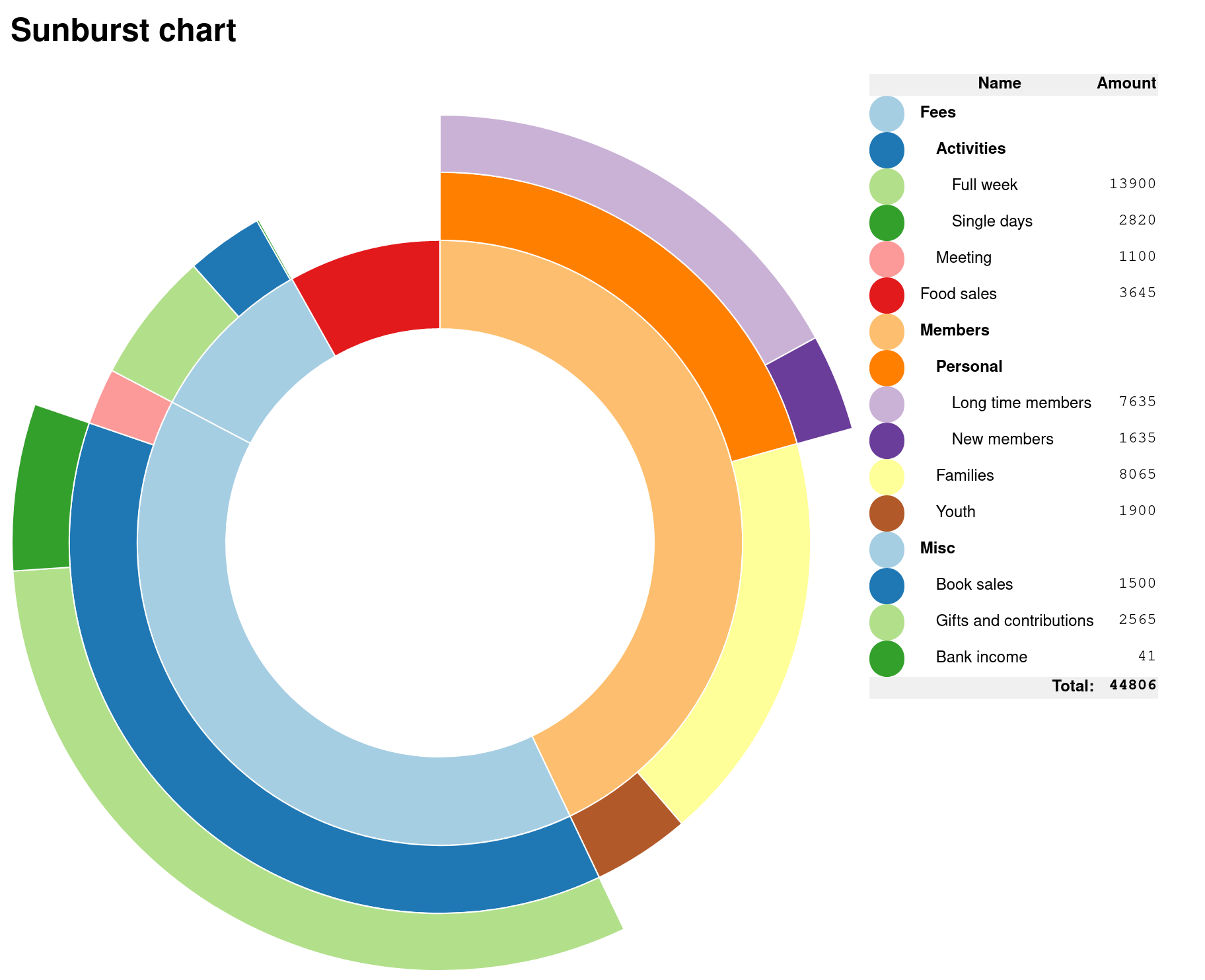
Sunburst
A Sunburst visualisation shows hierarchical data through a series of rings, that are sliced for each category node. Each ring corresponds to a level in the hierarchy, with the central circle representing the root node and the hierarchy moving outwards from it.
Features:
- Interactive sunburst chart that displays Name, Value and Percentage of Total when you hover over segments.
- Visualises data that is in a TSV format (CSV files, but separated by tabs instead).
- An interactive breadcrumb trail helps to emphasise the hierarchy.
- Percentages are shown explicitly, to help overcome the distortion of the data that occurs when using a radial presentation.
This is an adoption from work done by Kerry Rodden.
There are several improvements in this adoption:
- Works on d3.js version 7.
- Works on dynamic data, without any code changes being needed.
- The size of the sunburst diagram is set on one place (in the css file), and the rest of the diagram (including the text in the middle of the circles) will adjust accordingly.
- The length of the breadcrumb trail adapts to the size of the content instead of being static.
- A nicer legend.
- The names and values in the in-data is separated by tabs instead of commas, and the names are separated by semicolons instead of hyphens. This allows for more characters to be used in the in-data names.
- Support for printing.
The chart is written in JavaScript with d3.js. The code is available at my GitHub account.


 Wikimedia Commons
