Gapminder
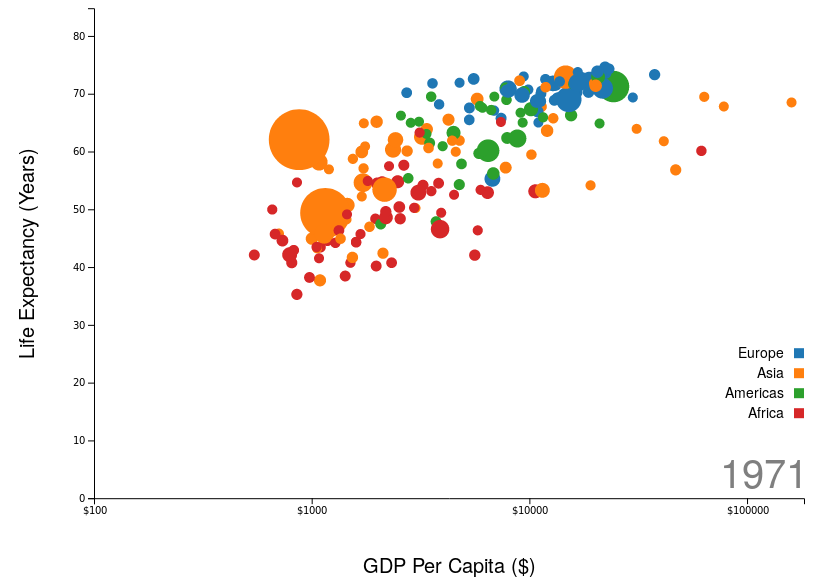
A data visualisation of the development of 200 countries over 200 years. This is a clone of the famous bubble diagram by Gapminder, made popular by professor Hans Rosling and the Gapminder Foundation on TED talks and elsewhere.
The chart shows how the world evolves over time, with a logarithmic scale showing a country's GDP per Capita on the x-axis, and life expectancy in years on the y-axis. The size of the bubbles reflect the population of the country, and each bubble is coloured according to which continent it is in. The chart shows that contrary to common belief, the whole world is becoming a better place to live in. Of course there are differences and some places in more dire need than others, but pretty much each country is much better off now than a few decades ago. When people have an income that they can survive on and when the life expectancy where they live is reasonable, they start having fewer children, which is vital on an overpopulated planet.
The chart is created using d3.js, a JavaScript library for creating rich data-driven documents. The code is written in modern JavaScript. The chart can be interacted with using the controls above the chart. The code is available at my GitHub account.


 Wikimedia Commons
